
WHY THEY CAME TO US
The app looked done. The screens were polished, the food photography did real work, and the team was rightly proud of it. But installs were not turning into second sessions, and trial-to-paid had gone flat. That pattern is telling: when a product looks finished and still underperforms, the cause is almost never one big bug – it is a dozen small credibility leaks, each quietly costing a slice of every user.
HOW WE AUDITED
Five weeks. We ran the whole funnel the way a first-time user does, sat with the analytics to see where people actually left, and interviewed both the internal team and real users the client gave us access to. Every screen was reviewed by three people at once – a UX designer, a senior engineer, and an analyst – because the flaw one of them waves off is usually the one the other two cannot unsee.
WHAT WE FOUND
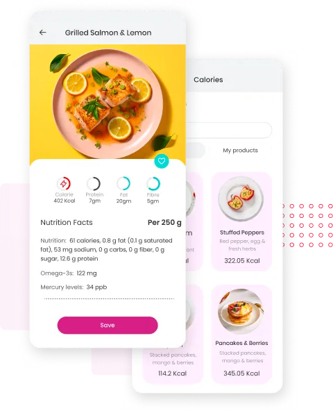
The detail card was the tell: it floats over the product grid and covers the item you just tapped, so the thing you are comparing against disappears exactly when you need it. Part of the catalogue still shipped with placeholder copy. Calories were printed to two decimals – 322.05 Kcal – which reads as scraped data rather than a curated database and quietly teaches users to distrust the numbers. And the app’s real edge, the omega-3 and mercury readings no competitor surfaces, sat at the bottom of a run-on sentence. The product was hiding its best feature and advertising its weakest.
The value
We did not hand them a redesign. We handed them a decision. Every one of the thirty-one issues was tied to a specific screen and a specific fix, scored by impact against effort, with the six quick wins that fit inside one sprint pulled to the top. The team stopped debating what to build next and started working down a list they already agreed on.
- Each finding tied to one screen and one concrete fix – never a vague “improve the UX”.
- Six quick wins scoped to ship in a single sprint, ahead of any larger rework.
- A ranked roadmap the team could run with or without us.
“We had stared at these screens so long we had stopped seeing them. This was the first time someone told us plainly which problems were actually costing us money – and in what order to fix them.”
– Head of Product, consumer health app